
- November 25, 2013
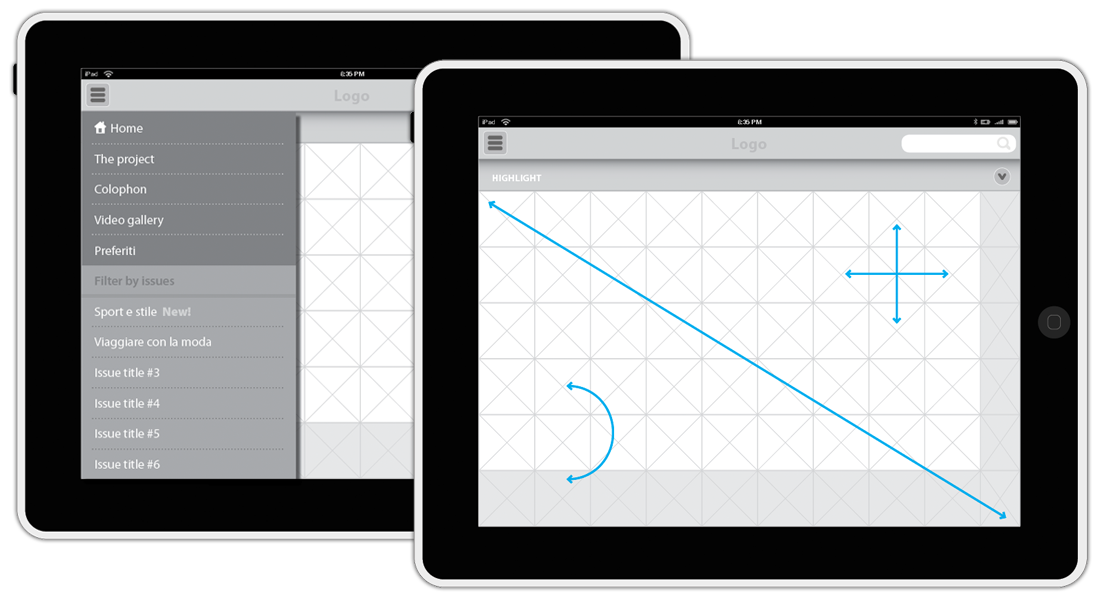
When designing for tablets, there are a lot of requirements to keep in mind depending on you’re working for example on a mobile friendly website, a Web app or a native app.
In the first case, it is important to define the right break points on your responsive website. In the second case, a portion of the screen is occupied by the browser menu, which means less pixels, but also default previous/next controls. In the third case, you have total freedom on UX design, but first make sure about the format: portrait, landscape or both, according to the Customer’s budget and objectives.
[/symple_column] [symple_column size=”one-half” position=”last”] [/symple_column]